
Continuing with my demonstration class on flower painting, I decided to use the photo below, which was actually a small part of a large flower arrangement. We spent quite a bit of time discussing getting good reference photos of flowers. It is just as difficult to photograph flowers as it is to paint them! One of the main problems is getting a good balance of light, so the shadows are not too dark, and the lights not too light. Contrary to what you might think, flower photos taken on an overcast day or in the shade often come out better. But dazzling sunlight is so beautiful on flowers, so here are some tips on photographing flowers in sunlight:
 Step 1. I like the composition as is, and traced it onto my watercolor paper using Saral Graphite Transfer Paper. To make the template, I enlarged the image with Photoshop to fit the available space (9x13") and then I printed it out in two sections on my desktop printer and taped them together. Actually I lightened the template a little to save ink:


- In situations of very bright sunlight and dappled light on flowers the resulting images can be very confusing. However sunlight on flowers can be so beautiful. Compose the picture so the bright light effects fall upon a darker, simple background, not a tangle of leaves and stems.
- The camera will exaggerate light and dark, making very stark value patterns, unlike what you see with the naked eye. Just keep this in mind when you paint the picture—you may not want the darks so dark.
- Bring out details in the shadow areas by aiming the camera at the dark shadows while you are focusing and holding the button down halfway. This way the light meter will adjust the exposure for the shadow areas, making them lighter. However, this will make the sunlit areas even lighter. You can take several shots, changing where you aim and take light readings.
- Try to compose an interesting interconnected white or light area through the painting—this will help give it a good overall abstract design.
Step 2. Here is how the transfer came out. I lightened it a little with a kneaded eraser so the lines would not show too much.
Step 3. I applied masking fluid to the absolute white areas so that I would not accidentally cover them:
Step 4. Now I applied a background wash that would represent the shaded parts of the flowers. White flowers are fun to paint because you can infuse the white shadows with subtle color. Their general color needs to be shades of gray, though, and here I have mixed three primary colors to create various shades of gray: hansa yellow, cobalt blue, and quindacridone red. This may seem crazy, but I decided to impose a certain style on this painting in which every single part of the painting will have the salt effect! Hence I sprinkled plain table salt all over the wet paint and let it dry naturally for a while.
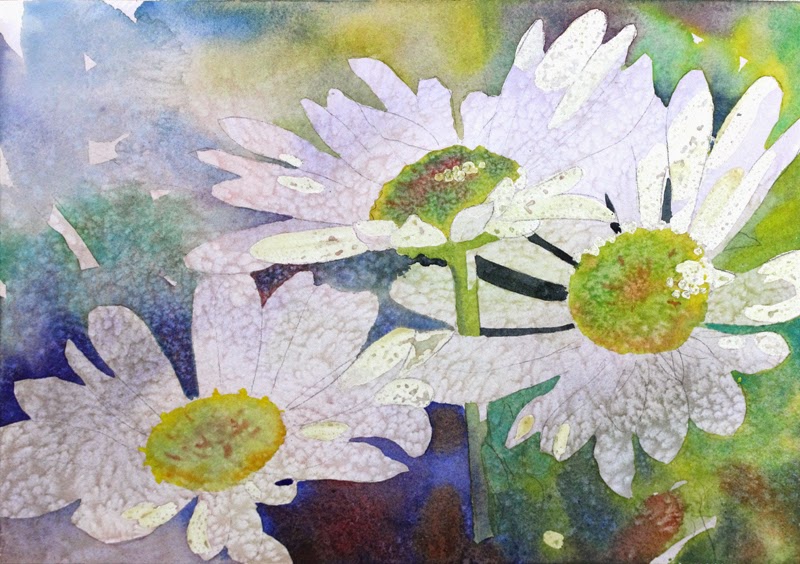
Step 5. Negative painting around the white flowers brought them out. I have eliminated the green spider mum, but am using primarily greens and blues in the painting, and keeping a cool color dominance. There are hints of orange added for contrast. Also, notice that the background wash is gradating from light in the upper left to dark in the lower right. I salted the background wash to keep the style consistent.
Step 6. Here is the painting pretty much finished. Sorry, I didn't take many step-by-step photos of this one! After taking off the masking fluid, I decided to do more shadows on some of the petals. Also the petals in the lower right were too dark, so I tried scrubbing them out a bit, but the paint was not lifting very well. So I used a little titanium white on those and several others. If you are going to use opaques in one area of a painting, you really need to use them elsewhere too, or they will stick out light a sore thumb! Also, darkening the background behind these petals made them appear brighter. It's all about the contrast and value changes!
 |
| "Shasta Daisy Daydream" watercolor 9x13" |
