Monday, September 20, 2010

Seven Characteristics of a Good Juried Show Painting

What are the characteristics of a painting most likely to be accepted in a juried show and possibly win an award?

This is the question many artists ask themselves. I have thought about this a great deal, having entered quite a few juried shows during my 30-year painting career, and here is my analysis of the seven characteristics of an award-winning juried show painting:

Intentionality: the artist’s intentions are clear and have been fulfilled—it looks like you knew what you wanted to do and did it with passion
Universality: the image has universal appeal and is something we all can relate to; it should not require too much “decipherment” or be so personal we can't figure it out
Execution: the painting shows a mastery of technique, whether it be abstract or realistic, tight or loose; the artist has confidence in the handling of materials
Conciseness: the painting tells one story, poignantly, without unnecessary components
Composition: a good underlying abstract design exists, the composition is balanced with no glaring mistakes in design
Creativity: the subject is not hackneyed, and if common, an uncommon viewpoint or treatment has been selected; the artist is getting us to look at things in a new way
Timelessness: the painting's subject matter would intrigue us at any time in history--it makes us stop and think about life and the universe

Here are some paintings that won awards in the BWS Mid-Atlantic Exhibition juried by Jean Uhl Spicer last spring 2010. What do you think? Do they meet some of the criteria mentioned above?:


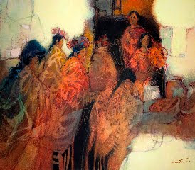
The Maya of Chichicastenango by Jan Ledbetter, Silver Medal


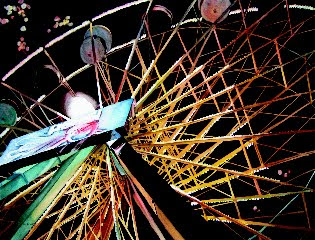
Stuck at the Top by Susan Stuller, Bronze Medal


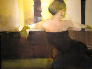
Green Gloves by Jeannie McGuire, $250 award


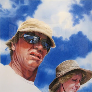
Voyage by Denny Bond, $133 award


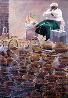
Charleston Market by Patricia Herlihy, $100 award


Between Us by Nancy Stark, $200 award


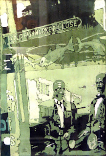
Old Fishmarket Close by Dale Sheldon, $133 award


Here is what some juror's have said they were looking for in selecting the pieces for the show:

“In choosing the paintings for the exhibition, I have kept three things in mind: exciting design, paint quality and strong values.” Frank Francese, juror of Baltimore Watercolor Society 2009 Mid-Atlantic show

“My challenge was to select those paintings that best conveyed creative approaches and displayed a personal concept regardless of technical ability. I also rely on the emotional resonse I feel at first look.” Jean Uhl Spicer, juror of 2010 Baltimore Watercolor Society Mid-Atlantic show.

“I looked for paintings that exhibited a very personal connection between the artist and the work”. Carl Purcell, juror 2009 National Watercolor Society show

“I responded to those works that made me think or see in a new way. Interpretation, a personal vision, strength of design, content, and authority in the use of materials were important as I made my choices.” Carol Pickle, juror of Adirondack National 2010 Exhibition of American Watercolor

“Before looking at any work, I decided on a further criterion for awards: I would reward original thinking—artists who took risks and pushed their media beyond traditional standards of execution.” Michaele Harrington, juror for awards of Kensington, MD “Paint the Town”, 2010

Here at ARThouse, I am currently teaching a course called "Art Professionalism and Independant Study". We are looking at questions like this with the aim of developing artwork that is professional and likely to succeed in the highly competitive art world. Juried shows serve a very important role in the art world: they help "raise the bar" on quality and inspire artists to do their very best work.

What do you think are the most important characteristics of a good juried show painting? What have I missed?

Susan Murphy, ARThouse, September 20, 2010


Tuesday, August 10, 2010

Painting portraits in watercolor

We held a portrait painting course here at the ARThouse Studio School this past summer, and I would like to share with you some of the things we learned about painting a portrait in watercolor and some of the results obtained from students! First, here are some samples of the demonstration paintings I did during the course:

"Oscar Wilde" watercolor painted in neutral tint, 10x13"

"Sasha" watercolor, 10x13"

"Chloe with Red Poppy", watercolor, 20x14

"Dad", watercolor, 14x18

Here are 10 tips for portraits:
  1. Make some decisions before you start: How loose or tight is the painting going to be? How are you going to handle the background? What do you want to convey about the person? How can you make this a more compelling portrait? What colors are you going to use?
  2. The face is basically a three-dimensional sculptural form. Give it form by concentrating on the shadow shapes and their values. Then worry about the features and details.
  3. Use a Masquepen to preserve small white areas that would be difficult to paint around, such as strands on hair or beard.
  4. A good color combination for flesh tones is brown madder, new gamboge, and cobalt blue medium. You can use any combination of these to produce different shades of skin, in light or in shadow. Beware of rose madder genuine since it is not really lightfast, and beware of cobalt blue dark because it granulates too much.
  5. Be aware of the soft edges of many shadows on the face. You can either try to obtain them directly by softening your edges with a damp brush after putting them down, or gently soften the edges with a stencil brush after they are dry.
  6. Be careful about using blues and purples in the flesh tones. Only use them in the shadows--in the light they can look like bruises.
  7. The value contrasts in your picture will help convey the type of light. In bright clear sunlight, the value contrasts will be very dark, while on an overcast day they will be subdued.
  8. Depending on your style, you may not want to over-emphasize certain things: teeth, if showing, should only be suggested, eyebrows made fairly light, hair painted mostly in tresses.
  9. Create a soft transition from the top of the forehead into the hair.
  10. Work from the general to the specific. Then, when you have added a certain amount of detail, you may find that you are done sooner than you thought!
And now, last but not least, here is a sample of some of the paintings students completed during the course:

"Charles Dickens", watercolor by Carol Riddle

"Chloe", watercolor by Jean Perretta

"Louisa", watercolor by Evelyn McKay

"My Little Girl", watercolor by Louise Jung

"Little Boy and Dog", watercolor by Donna Moeller

"Oscar Wilde" watercolor by Tanya Rostovtseva

"Man from Manassas" watercolor by Donna Moeller

"Checkered Hat" watercolor by Sally Drew

"A Little Girl I Know" watercolor by Mimi Hegler

Aren't they great!? We had a lot of fun painting these portraits, and many more will be on display at the ARThouse student show this December 4 & 5--stay tuned.

Susan Murphy

Friday, June 18, 2010

Come see! Our ARThouse Spring Show June 19-Sept 26


I hope you can come to our annual Spring Studio Show this weekend! If you miss the opening event, you can still see the show--it is on until September 26. However some of the paintings might be missing--we hope to sell a few! The opening, which is June 19 & 20 from 11-5 pm both days, is quite a gala event. We will have beautiful refreshments, including our May Bowl (Rhine wine flavored with home-grown sweet woodruff and decorated with flowers and strawberries), and lots of fancy finger foods. If the weather is good, the show will take place partially "en plein air" on the front lawn of ARThouse.

I am thrilled to introduce artist Roberta Staat to our ARThouse community. She is our new drawing instructor at ARThouse and I have invited her to join me in our annual studio show. Your invitation is above!

Roberta is a life-long artist who has lived in the Olney, Maryland area for about 20 years, and is well-known in these parts. She is co-organizer of the "Plein Aire Olney" outdoor painting event that will take place in September. Please see the ARThouse website for more information about this--www.arthouseart.com.

Roberta is one artist who loves to draw! Especially cows and farm critters! She also paints beautifully in oil, using a bold, painterly style. You can see many of her paintings at the show.

Roberta has been teaching beginner and intermediate drawing classes at ARThouse this past year, and is starting a new class on June 21, "Drawing the Face and Figure". You may still be able to sign up--again, go to our website at www.arthouseart.com to find a registration form.

Hope to see you at the show!
Sue Murphy

Monday, May 17, 2010

I attended an amazing conference: "Art of the Portrait"

Hi Folks! Just wanted to fill you in on an amazing 4-day conference I attended in April: "The Art of the Portrait" 2010 annual conference sponsored by the Portrait Society of America and held in Reston Virginia. I am so glad I went to this event--it was worth every minute and every penny! My sister, Doris Murphy, from Pennington, NJ, came with me and we had a lot of fun.
The organizers, who are some of America's best artists of portrait and figurative art, invited 15 "faculty members" to come and give talks and demonstrations before an audience of about 800 artists from all over the country. For more info and list of the faculty, check out their website at www.portraitsociety.org. Also, for some live material, check out their Facebook page at www.facebook.com/pages/Portrait-Society-of-America .

For me, some of the highlights were the "Face-off", where the 15 invited faculty members painted live models for 2 hours in a setting where you could walk around and watch them up close. I was particularly interested in watching Robert Liberace paint the model "Ellyn", because the next day, Doris and I would be taking a drawing workshop with him. Here are some photos:


Another highlight was a special event they had called "The Mystery Panel Sale". I have never seen such an art buying frenzy! The Portrait Society asked 140 respected portrait artists to paint and donate a 6x9" masonite panel to be sold at this event. Each painting was $225 and none were signed, so you did not know who the artist was, and some were very famous... The paintings were all covered with a black cloth, except for a 10 minute period when hundreds of people were present, and they were unveiled. You had 10 minutes to decide which one you might like to buy. I had my eye on #48, which I suspected was by last year's Grand Prize Winner, Joseph Todorovitch. Wouldn't you know, about 20 other people wanted that painting. So we all put our name badges in a hat, and they drew mine! And lo-and-behold, it was by Joseph Todorovitch! I was the happiest person around, and everybody was so jealous! I was introduced to Joseph, and here is my photo with him and his beautiful painting, "Corina":


Joseph is a truly amazing painter and very nice person. You should check out his website at: www.onejoseph.com. Here is a close-up of his painting after I framed it:


And my sister Doris bought this beautiful painting by Maryland artist Sam Robinson--here she is posing with the artist!:


Another highlight was the watercolor demonstration by Mary Whyte using Burt Silverman as a model! They had three huge video monitors in the ballroom, so that anyone in the huge room could get a good view of the demonstration. Here is Mary talking with Burt and the split screen image we were watching as Mary Whyte did her portrait:


Taking this conference served me very well, since I have been concentrating on painting people lately. In fact, it was an excellent preliminary activity for the course I will be teaching at ARThouse this summer, called "Painting the Face and Figure in Watercolor". We are also having a drawing class this summer called "Drawing the Face and Figure" taught by Roberta Staat. See my website www.arthouseart.com for information about classes at ARThouse.

Thanks for taking the time to read my blog. Let me know if you have a comment! --Sue

Wednesday, April 14, 2010

I took a great workshop with Jean Uhl Spicer

Hi Folks,

I just got back from a great four-day watercolor workshop in flower painting with Jean Uhl Spicer. Jean is a wonderful artist from Philadelphia who has been working professionally as a artist all her life, and recently published a book with North Light called "Bright and Beautiful Flowers in Watercolor".

The workshop took place at the Howard County Center for the Arts in Ellicott City, Maryland, and was sponsored by the Baltimore Watercolor Society. Jean was the juror for the BWS' 2010 Mid-Atlantic Watercolor Exhibition this year. The show starts Saturday, April 17, at Strathmore Hall in Rockville and is an absolute must-see!

Each day in the workshop we took a different approach to painting the incredible fresh flowers she brought in. Below I am going to show you some examples of the paintings she did, and the paintings I did, and try to explain her technique a little bit.

Below is a picture I took of Jean demonstrating, and also some examples of Jean's paintings from the workshop.


Below are some of the paintings I did in the workshop (the last one is not finished yet), and then I will describe Jean's approach and palette of colors:


To me, Jean's flower paintings are characterized by an incredibly vibrant, cheerful look in which the flowers have a lot of personality and look almost cute and perky. She really simplifies and stylizes what she sees so that the main subjects of the painting are really color, shape and value. You appreciate the beauty of her paintings, not only for their depiction of flowers, but for the way the gorgeous colors flow and the interesting shapes interlock.

One key to her success with color is the palette of colors she uses. For yellows, she uses aureolin, Hansa yellow, and quinacridone gold. For reds, quinacridone red, cadmium scarlet, permanent magenta, and brown madder. And for blues she uses cobalt blue, French ultramarine, cerulean blue, and Antwerp, and occasionally Payne's gray. She doesn't have any greens or purples on her palette, but creates them with beautiful mixtures of the above colors.

Another key is the fact that she always squeezes out fresh paint. Her manner of application is very wet and juicy with lots of rich color. She encourages colors to blend together on the paper from one flower to another, creating interesting watercolory effects. Later she glazes with still bright, but darker colors in order to pull out details and negative shapes. These are just some of the ideas she conveyed in the workshop.

Other students in the workshop did excellent work and everybody had a great time. Jean Spicer is an extremely nice person and very capable teacher. Check out her website at www.jeanuhlspicer.com

I hope you enjoyed this posting, and please let me know your thoughts.

Friday, March 26, 2010

Painting on watercolor canvas


Painting on "watercolor canvas"

I have always wanted to try that "watercolor canvas" sold by Fredrix, because I thought it might produce some interesting surface characteristics, especially a nice "woven" look. Painting watercolor on canvas didn't make much sense to me, I admit, but I am always looking for unusual textures. So I bought a bunch and had my classes experiment with it. It cost about $5.00 for a 12x16 inch piece, and comes with a nice brochure explaining its use.

At the same time, I have been painting a lot of portraits lately, and have always wanted to paint from old-fashioned photographs of ancestors, etc. One nice thing about watercolor canvas is that the paint wipes off with water extremely easily, so it lends itself to my favorite technique of putting the paint on and then taking it off! That is, selectively removing the paint to get the light areas of the picture without laboriously having to paint around them or mask them out. I like to use this technique for portraits and have been doing a series of paintings in this style.

So we all brought in old black & white or sepia-toned pictures and had fun selecting. We discussed the importance of painting from your own photographs first, though. In this case, we did not take the photos, but it seems like they should be fair game because after all, they are pictures of our own family members and we should have a right to paint them. I am referring to the dilemma of borrowing subject matter that has been gathered by others before us. This is a tricky subject in the art world. Generally, you would not be able to submit a painting based upon someone else's photo to a juried show, where the premise is that the artwork is completely your own, from start to finish.

There is a large "gray area" here though, in my opinion. Of course, for your own painting, you can paint anything you like. For the sake of your integrity, though, you shouldn't try to pass it off as your own if it is based on someone else's photo. It is not just a matter of copyright, but of the fact that a lot of creative effort goes into choosing the subject matter and circumstances of shooting that photo, and you had little to do with that creative effort except in choosing the photo as a reference for your painting. What about cases where you incorporate just a little bit of someone else's material, or abstract it a lot? A rule of thumb is that if a non-artist should look at your painting next to the source material and be able to say that "this is a copy of that", then it is too close. All artwork is derivative to some extent. We are all influenced by other work and subjects we see, but our work must not be so derivative that it is obviously a copy.

That being said, however, I chose to paint a picture of Charles Dickens as a demonstration of painting a portrait on watercolor canvas. I would not submit this painting to a juried show. But I think the image, which I obtained from the web, is fair game for a painting. The image is about 150 years old and Charles Dickens died in 1870. Why can't I paint him? What do you think?

The other painting is of my great-great-grandmother, Lydia Hurlbut Loveland. How do you like that name? She was married in 1850 to Robert Packer Brodhead, I believe, and they lived in Kingston, NY. The painting on the wall in the picture is one of my paintings of my son Paul. So it is my great-great-grandmother sitting in front of a painting done by her great-great-granddaughter of her great-great-great-grandson! How's that for time travel?

The paintings were both started with a wash of burnt umber, and then paint was both removed and applied after that. It is a fun process and the surface is highly re-workable, similar to an oil painting. I think I really like this watercolor canvas! Let me know what you think...

Sue


Tuesday, March 16, 2010

Painting watercolor on gessoed board


I am teaching a course in my studio, ARThouse, this spring about painting in watercolor on different surfaces, other than the usual Arches 140 lb cold-press that so many watercolorists rely on. Last time we painted on gessoed illustration board, something I hadn't done in a while, and the results were very interesting. If you've never tried this, you really should! Above are some of the demonstration paintings I did for the classes.

On this surface, you end up seeing the brushstrokes made when applying the gesso. It has an interesting effect--almost like an oil painting that is actually a watercolor. But it depends on how you apply the gesso. Here is how I did it:

I took a sheet of 4-ply Strathmore 500 illustration board (acid-free) and cut it up into the desired size (the mug is on a 6x6 inch sheet, while the painting "Beach Boys" is on a 12x19" sheet. Then I taped the edges with 1" drafting tape to get a clean edge at the end. I then applied acrylic gesso with a 1" flat brush, using about 1 Tbsp for every 6 sq inches of board. I applied it evenly and then created interesting brush marks in the wet gesso, similar to one of those old-fashioned plastered ceilings. I let this dry for several hours.

When you paint on this surface, it is kind of weird. The watercolor beads up at first and just lies on the top. The great thing is that it is almost completely removable when dry. So this surface is extremely "re-workable". My painting style relies a lot on selective removal or paint, so I love this attribute. Try it--you'll like it!

--Sue

Wednesday, February 17, 2010

ARThouse Studio School


Welcome to the ARThouse School Blogsite!

Hi, I am Susan "Avis" Murphy, the creator of this blog, an artist, and owner and operator of the ARThouse Studio School in Sandy Spring, Maryland. In a nutshell, ARThouse is my personal studio/gallery for creation and display of my watercolor paintings, and it also is a venue for art teaching and workshops. Hence we are now calling it the ARThouse Studio School.