Friday, March 7, 2014

Watercolor Demonstration Class: Still Life with Pears and Strawberries -- Part 3

OK, I am back again.  The painting is almost finished, for better or for worse!  I have made a lot of changes.  Here is where I had left off last time:

Step 10.  I have decided to completely change the background.  The "flannel" gray is just too distracting, and I think the pitch black of the reference photo is more effective.  I experimented with my painting on the computer using Photoshop to make the background black (see below).  Also I decided to get rid of the upturned dish towel in the back and make the whole table look round instead. To accomplish this in Photoshop, I selected the dark background using the magnetic lasso tool, and then I went to Image > Adjustments > Levels > I turned up the darkness of the selected layer.  It is interesting how making the background black really brought the objects to life!

background artificially blackened with Photoshop

Step 11.  Now in order to change the background and lower it about 2", I first had to soften the edge of the dish towel in the back and try to get rid of the stripes.  I was afraid the edge and the stripes might show through in my new wash.  I surrounded the objects with drafting tape (as you can see below between the pear and the pitcher) and I used Mr. Clean Magic Eraser to scrub out the paint.  This left a hard edge next to the objects and a soft edge going up into the wash.  You can see a little piece of the magic eraser at the bottom.  You just wet them and scrub.  I dried the picture thoroughly.
 
background scrubbed out and softened

Step 12.  Now I felt that I had to re-paint the lightened background with the same color I had used before, so that when the final very dark wash was put on, it would be uniform everywhere.  Oh, before doing this, I scrubbed out some leaves on the white bouquet, using drafting tape to form the shapes.
original wash mixture re-applied
Step 13.  Hopefully this won't be the unlucky step!  For my new wash I mixed up a very dark pool of perylene maroon and perylene green (two colors by Winsor & Newton that are very dark and clear) because they are complementary colors and form beautiful grays and blacks.  I turned the board upside-down and propped it up about 2" so the wash could run downhill, and proceded to do a big juicy wash using a #12-14 brush.  There was no masking fluid on this time, so I had to paint carefully around the flowers. I think the picture looks better already!

new black wash applied
Step 14.  Now I began to finish painting the white flowers and their vase.  The peony-like flower was very confusing and I had to study the photo carefully.  I got lost anyway, but it doesn't really matter.  I used a combination of bluish purples for the shadow shapes, blending to yellowish green as they went deep into the flower.

working mainly on the white flowers
Step 15.  I continued working on the white flowers and the interesting shapes inside their vase.  I added a slight curvature to the right side of the table.  The pink carnation hasn't been worked on again yet, but I don't think it needs much.  The painting needs some further refinements, but this is it for now.  I need to take a break!
"Pears and Strawberries" almost finished

 In conclusion, this really did turn out to be harder to paint than I thought it would be.  I am not crazy about the composition because of the amount of black background.  Perhaps the pink carnation could be cropped out.  Below is how it would look.  What do you think??


Susan Murphy, ARThouse, March 7, 2014


Thursday, March 6, 2014

Watercolor Demonstration Class: Still Life with Pears and Strawberries -- Part 2

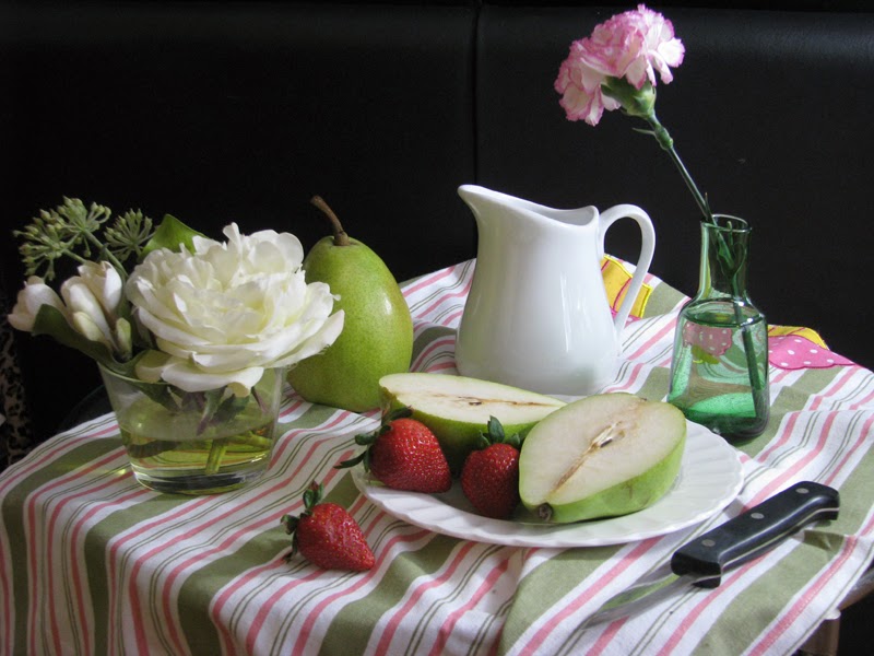
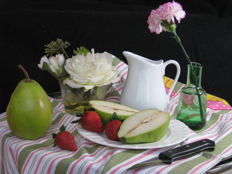
In Part 2 of this article I will describe how I did the painting that goes along with the reference photo below.  As usual it turned out to be harder than I thought, and I wasn't able to finish it in the three classes that we had, so Part 3 with show the finished steps that I did on my own.
 
reference photo
 
Step 1.  First I created a paper template of my reference photo by printing it out on cheap paper with a medium format (17" wide) printer.  I am lucky to have the ability to do this.  To do it on a smaller desktop printer, you could crop the image into four letter-size pieces, print them out, and tape them together.  My watercolor paper is a 16x20" sheet of Archers 140 lb cold press that has been stretched and stapled onto a Gatorboard.  Strips of 1" 3M drafting tape were put around the edges of the paper so that the resulting painting would have a nice, clean border.  The template was laid on top with several sheets of gray graphite transfer paper (wax-free Saral brand) underneath.  All the contour lines were traced with a ball point pen to transfer the image onto the paper.  By the way, you see here the Kodak Color Bars I laid on top when I photographed this image, so that the white balance could be corrected later on the computer.
template created on medium-format printer

Step 2.  Here is how the drawing looks on the watercolor paper after the tracing.  The graphite can be erased a little with a kneaded eraser if you feel it is too dark.

the drawing transferred onto the watercolor paper

Step 3.  Since I was planning to do a dark background, I decided to mask out the pink carnation and some of the little white flowers.  I used a Masquepen, which is a little squeeze bottle with a pointed applicator. Next I decided about the colors I would use.  I wanted to keep a soft, granulated look in the painting, so I chose to mix all the greens using mainly Hansa yellow (an arylide yellow) and either cerulean blue or ultramarine blue.  Here I have painted the pear and the shadows.  The dark corner on the pear was done by mixing more ultramarine blue into the wet paint.  A little brown madder (a red color) was dropped into the pear for color variation. 
     I decided to paint the shadows on the dish towel before doing the stripes, because most of the colors I use are very "liftable" (i.e. they are not staining colors) and I was afraid the stripes might lift off if I painted the shadows later.  The shadow color is a mixture of ultramarine blue and brown madder.
masking fluid applied, plus pear and some shadows painted

Step 4.  I decided to start painting the background early in the game in order to get an idea of how dark all the values would need to be.  I debated about two possible solutions for the background: 1) doing a very dark, smooth wash that would look almost black, as in the photo, or 2) doing a softer "flannel gray" background that would have a granulating texture.  I went for the latter because I thought the black might be two strong.  For this wash I mixed about a 1/4 cup of three primary colors in a separate container: Hansa yellow, ultramarine blue, and brown madder.  It came out a little bluer than I intended.  To apply the wash, I turned the board upside down and propped it up about two inches, and started applying the paint with a big brush along the "action line" (where the subject meets the background).  Working along sort of horizontally, I let the paint move down the sheet with a bead of wet paint always on the leading edge.  It is important to have the board slanted and leave it that way in order to avoid getting backruns.  Despite this, the wash was a little more variegated than I wanted, but I decided to let it dry as is instead of fiddling with it.

background wash applied

Step 5.   This painting was done over the course of three different class groups in two days.  In order for each group to see similar parts of the process, I worked a little on this and a little on that...  So here I am showing how I would start the stripes on the cloth.  For the sake of unity, I am using the same pigments wherever possible.  So the green stripes were mixed with Hansa yellow and ultramarine blue and the red stripes are primarily red madder.  The most narrow green stripes were applied with a liner (also called a "rigger" because this long, narrow brush can be used to paint rigging of nautical paintings).   By the way, the yellows you see on the white flower and its vase are yellow paint that I put in as a base color (it is not masking fluid). 
starting the stripes

Part 6.  Here I have done more stripes, two of the strawberries, and the base color on the knife.  One thing I like about this set-up is the way the stripes appear inside the two glass vases.  To give the illusion of clear glass, you need to paint what is behind it and under it!  Just paint exactly what you see, simplifying it a little since all the reflected and refracted shapes can be very complex!  Here the vase on the right had water in it, and was acting like a very strong lens, really distorting the stripes behind it.
    For the strawberries I started with a base color of brown madder and added a touch of ultramarine blue for the dark shadow.  BTW, the tiny seeds had been masked out.  The stripes on this towel are fun because they accentuate all the folds, which is all the nicer and makes the painting more interesting.
starting the strawberries; more stripes

Step 7.   Painting the white cream pitcher was fun because of the opportunity to show reflected light in the shadow side.  If you look closely at the reference photo, you can see a touch of green coming from the pear in the shadow side of the pitcher.  This is the advantage of including white objects because these reflected colors will really bring them to life!
    The quintessential problem of watercolor painting is getting the paint to stay where you put it.  Since the pitcher had almost all soft edges, I was going to have to work wet-in-wet.  So I wetted the whole pitcher with clean water and stroked in the shadow color, using the same combination as on the dish towel, namely cerulean blue and brown madder.  When this was still wet, I stroked in some of the bright green from the pear.
    For the clear glass green vase, as a first step, I just tinted the whole thing with viridian green, making it darker on the bottom. 
painting the pitcher and green vase

Step 8.  This photo simply shows what the painting now looks like with the masking fluid removed.  I hesitated to do this because I am considering re-doing the whole background, but I decided to take my chances.
masking fluid has been taken off

Step 9.  A lot has been done in this step.  The pink carnation has been given its base coat, and some of the flower stems have been painted in with very dark tones. I started darkening some of the shadows, such as the side of the cut pear.  Also some reflections were lifted out of the creamer.  The knife blade has been painted, showing a slight reflection from the cut pear above it.  I still haven't really addressed the white flowers because I need to do some more drawing in there -- they are very confusing to paint and I was getting lost!  I did tint the tiny flowers green and paint the leaves on the strawberries. 
 "Pears and Strawberries" almost finished

     This is where I left off at the end of the last class.  Part 3 will show how the painting was finished.  As it stands now, I see some problem areas.  I am not crazy about the background or the way the pink carnation sticks up into it on that spindly stem.  I may add some thicker leaves around the carnation to break up the background a little.  Also I may add some thicker leaves behind the white flower that will go up into the background and break up that large rectangular shape made by the left side of the background.  I don't like the equilateral triangle we have to the left of the white flowers.  I am wishing the table looked more round and may get rid of the way the cloth rises up a little behind the pitcher.  All these changes should be possible because I have been using liftable paints.
     I am considering changing the whole background to a much darker color.  This will be tricky for several reasons.  Working a large wash around the complicated edge will be tricky.  Painting on top of an existing wash is always uncertain.  Since the existing wash does have liftable paints, they will re-dissolve and could create mud.  So before I take this drastic step, I might open the painting photo is Photoshop and play around with darkening the whole background.  Stay tuned!

I will work on finishing this painting today and post the remaining steps on this blog by Friday late afternoon.  Wish me luck!

Sue Murphy, a warmer day in March, 2014

Watercolor Demonstration Class: Still Life with Pears and Strawberries -- Part 1

I have been away from my blog for a while and am happy to return!  I just taught a class on Still Life in my studio, ARThouse, in Sandy Spring, Maryland.  As part of my teaching, I usually publish an article on this blog after the demonstrations are over, so that I can further explain the process to the students.  This is going to be a three-part article.  The first part will focus on arranging and photographing Still Life, the second on the class demonstrations, and the third on finishing the painting in the studio.

Still Life is a huge subject area for artists.  Here we are focusing on a modernized version of a traditional still life with objects arranged in a semi-formal fashion. I chose objects that had a universal appeal and were readily understood.  Here is the reference photo I used for the demonstration, and below I will explain how I created this arrangement.


What are the objects sitting on and where are they?  The whole still life is sitting on a small round end table that happens to be on wheels.  This proved very useful because it could be moved around the room until I found a good lighting situation.  They were in a room with a very large window so there was a lot of unavoidable light on the front of the objects.  I set up a bright light off to the right to give them some side lighting.  For a more dramatic effect I could have wheeled the table into a darker room, but I wanted a bright and cheerful look.  The cloth is a dishtowel.

Why these objects?  We were having a snowstorm and the only fruits in the house were pears and strawberries!  But I like the archetypal appeal of these classical fruits.  Since this was a class demonstration, I chose objects that would demonstrate different surfaces, such as clear glass, a shiny ceramic pitcher, some flowers, and a draped cloth with a pattern on it.  Also they were chosen because they varied in height and shape.  I purposely chose a simple color scheme of greens and reds so that the painting would be more unified.  I felt the colors were soft and harmonious.

Why this background?  I experimented with different backgrounds, first starting by setting the table in front of a white cloth couch.  When I moved it in front of a black leather chair, the value contrasts seemed much more effective.  So the black background is simply the back of a large chair!  Below are some of the other photos I took of the still life:

light too bland

no small objects

better, but light still too bland with no strong shadows

placed a black blanket over the couch; light still too bland

better, but pear on left too prominent

best, with stronger lighting and whole pear partially obscured 

Here are some tips for setting up still life:
  • Choose objects that you like but are not too obscure.  Weird little possessions that might mean a lot to you don't necessarily work well in a still life.  Choose objects that are different heights and volumes.  Choose a papa shape, mama shape, and several baby shapes.
  • Find a good light source, such as a window, or use a strong lamp.  Photography lamps can actually mimic a strong light source such as sunlight, and you can get some excellent effects.  Use side lighting to create simple shadow shapes.  Be wary of too many light sources casting shadows and reflections all over the place.
  • Place the objects on a white or light surface, so that you will have interesting cast shadows.  White is excellent because the shadows can be infused with reflected light from colored objects.
  • Avoid strong diagonal lines, such as the edge of a table.  The table I used was round, which created a nice curved shape at the bottom of the picture.  It is usually better to have the table edge go horizontally across rather than be at a diagonal.  Also it is best if the table edge is interrupted by a cloth or object going over the edge.
  • Plan your background when you are doing the photography.  Making up a background after the fact is one of the hardest things in watercolor.  It is best to be sure your reference photo already contains a good background.  When the background appears behind glass objects, it can be used to really illuminate the glassiness of the object, as you can see with the green glass vase in my reference photo above.
  • To make your cast shadows look really light and airy, have an object pass from the light into the shadow (such as a spoon, napkin, pencil, etc.).  This makes the cast shadow very convincing!
  • What tips can you think of?  Would you be willing to leave a comment to add some additional tips?  I would really appreciate this!
Your Watercolor Challenge:  Arrange a still life using the tips and ideas in this article and paint it in watercolor!  When you are finished, send me photo of the painting by email and I will post it on this blog!

Happy painting!  --Susan Murphy, on a cold day in March, 2014
Next time in Part 2:  How to get your drawing onto your paper, and how to paint your still life in watercolor!