
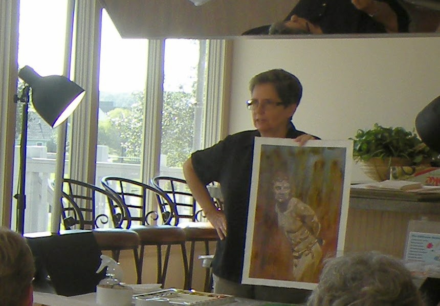
I was invited to teach a two day workshop for the Delaware Watercolor Society in Rehoboth Beach. The workshop took place at the beautiful Glade Community Clubhouse. The workshop centered around painting the image of a statue using my rivulet and lifting techniques.
I have talked about this "rivulet technique" before (see October 2012). What the heck is it? It is a technique I developed about 30 years ago to create an interesting texture on the watercolor paper at the beginning of the painting process. After the entire background is washed in using this texture, the painting is then developed by lifting off the light areas and glazing the darker areas. Here is an example


Students either brought their own photo references of statues or they borrowed one of mine. The first step was to get the drawing onto the watercolor paper, either by drawing freehand or using a paper template to trace the image with graphite transfer paper. I feel that this is justified to save time (especially in a workshop) if you are already skilled at drawing. If not, please practice!

Students came in with some fabulous reference photos!


Now I started my demonstration of the rivulet technique. Below is an example of the first step. You start by mixing up a small tub of raw or burnt umber (best if by Winsor & Newton) to a heavy cream consistency. Have other non-staining colors ready. This approach relies heavily on using non-staining colors that are "liftable". Now wet the paper (Arches 140 lb. cold press) all over and then put splotches of color, mainly raw umber, all over the sheet. Be sure to keep it wet throughout this process. Add a few splotches of raw umber that is much thicker too, since this is where many of the rivulets will form.

Next you are going to hold this sheet vertically (really must be on a board) and then spray gently with water. The paint will begin to drip down, and form "rivulets". This is more than just dripping paint, which any color will do. There is something unique about the raw umber, where its sticky quality causes the water to run down through it forming interesting little channels or striations. Sorry but I don't have a photo of the water spraying step.
After this background wash has dried thoroughly, you can start "lifting out" the light areas with a stencil brush. The painting I did as a demonstration was of a statue of a shaman that I photographed in Sedona, Arizona, shown below. He is already very textured, and I thought he would lend himself beautifully to the rivulet technique!

I usually begin lifting with the fine details of the face. Very small stencil brushes with a flat top are best for this. For this purpose, you need stencil brushes that are made of natural hog's bristle, that are a medium stiffness, and that are round and flat across the top. For fine details, you need a small one of these with hairs about 1/8" long. You can make your own by giving a small bristle brush a little crew cut! To lift the paint, just wet the brush, scrub gently on the paint, and blot with a paper towel. You will be amazed at how easily the raw umber lifts off, and how nicely you can create form with soft and somewhat hard edges.
.jpg)
 As you can see, I have also started to glaze darker colors on the figure. For glazing, you want to use clear transparent colors and apply them gently so that you do not wash off the underlying rivulet wash. The rivulets can show through the entire picture if you are careful! Some of the other colors used in the painting were:
for the background wash: verditer blue and brown madder (both liftable)
for the transparent glazing: permanent violet, cobalt blue, titanium white, brown madder
.jpg)
I continued working on the body. Lots of decisions to make about what to emphasize and how to handle things. Below you can see I have glazed the upper background with a thin wash of titanium white to take it down a notch and provide more contrast with the figure.
.jpg)
The shaman had an interesting kind of "shield" on his chest which was challenging, but I finally figured out how to paint it with a combination of lifting and glazing techniques. Also, below you can see that I have glazed the lower background with dark permanent violet, gradated up to a lighter shade, to bring out his body.
.jpg)
This photo was taken back home under different lighting, so the color appears a little different. This is as far as I have gotten during the workshop. I am thinking of introducing some petroglyph shapes into the background.
.jpg)
In this close-up, you can see how the rivulet wash looks, and see how the verditer blue applied in the very beginning is still showing though with nice splotches of bright color.
 Now the students tried it! First they practiced achieving the rivulet effect on a small piece of paper. It is not easy the first time, and takes some practice to get the right consistency of paint, and to spray the right way.


Here are some of the rivulet washes that people successfully put on their final paintings:


And here are some examples of students at work the second day, when they were fairly far along:


Last but not least, here are some samples of almost finished paintings! I wish I had more photos of the finished paintings. If you were in the workshop, please email me with photo of your painting, even if it is not quite finished. I would love to add it to this article! If you give me a title, I will include your name and title with the image.


As you can see, the members of the Delaware Watercolor Society who took this workshop did some fabulous work! People seemed to enjoy the process of using stencil brushes to lift out their shapes and give form to their statues. I feel it is very liberating because it is so easy to achieve those elusive soft edges just the way you want! I don't always paint this way, but even with my other painting I often use stencil brushes to soften edges and get exactly the look I want. After all, they say "it all happens at the edges", and I think this is really true with watercolor. So, the take home message of this article is: Consider using liftable paints and stencil brushes to create form in your paintings!
Thanks to the Delaware Watercolor Society for inviting me to teach this workshop-- it was a wonderful group and a lot of fun!
Susan Avis Murphy, ARThouse, 9/9/14
I have talked about this "rivulet technique" before (see October 2012). What the heck is it? It is a technique I developed about 30 years ago to create an interesting texture on the watercolor paper at the beginning of the painting process. After the entire background is washed in using this texture, the painting is then developed by lifting off the light areas and glazing the darker areas. Here is an example
 |
| Gudea of Lagash 13x20" Susan Avis Murphy |
 | ||||
| detail showing rivulet effect |
 |
| The Martyr (a statue of Saint Sebastian by Joseph Sheppard) |
I started by showing examples of paintings done in this manner. Originally I applied this technique to my construction rubble paintings, and gradually expanded to other subject matter. It is an unusual way to paint in watercolor, in some ways more akin to oil painting where we start with a raw umber background wash and then work toward lighter and darker areas from there.
Students either brought their own photo references of statues or they borrowed one of mine. The first step was to get the drawing onto the watercolor paper, either by drawing freehand or using a paper template to trace the image with graphite transfer paper. I feel that this is justified to save time (especially in a workshop) if you are already skilled at drawing. If not, please practice!
Students came in with some fabulous reference photos!
Now I started my demonstration of the rivulet technique. Below is an example of the first step. You start by mixing up a small tub of raw or burnt umber (best if by Winsor & Newton) to a heavy cream consistency. Have other non-staining colors ready. This approach relies heavily on using non-staining colors that are "liftable". Now wet the paper (Arches 140 lb. cold press) all over and then put splotches of color, mainly raw umber, all over the sheet. Be sure to keep it wet throughout this process. Add a few splotches of raw umber that is much thicker too, since this is where many of the rivulets will form.
Next you are going to hold this sheet vertically (really must be on a board) and then spray gently with water. The paint will begin to drip down, and form "rivulets". This is more than just dripping paint, which any color will do. There is something unique about the raw umber, where its sticky quality causes the water to run down through it forming interesting little channels or striations. Sorry but I don't have a photo of the water spraying step.
After this background wash has dried thoroughly, you can start "lifting out" the light areas with a stencil brush. The painting I did as a demonstration was of a statue of a shaman that I photographed in Sedona, Arizona, shown below. He is already very textured, and I thought he would lend himself beautifully to the rivulet technique!
I usually begin lifting with the fine details of the face. Very small stencil brushes with a flat top are best for this. For this purpose, you need stencil brushes that are made of natural hog's bristle, that are a medium stiffness, and that are round and flat across the top. For fine details, you need a small one of these with hairs about 1/8" long. You can make your own by giving a small bristle brush a little crew cut! To lift the paint, just wet the brush, scrub gently on the paint, and blot with a paper towel. You will be amazed at how easily the raw umber lifts off, and how nicely you can create form with soft and somewhat hard edges.
for the background wash: verditer blue and brown madder (both liftable)
for the transparent glazing: permanent violet, cobalt blue, titanium white, brown madder
I continued working on the body. Lots of decisions to make about what to emphasize and how to handle things. Below you can see I have glazed the upper background with a thin wash of titanium white to take it down a notch and provide more contrast with the figure.
The shaman had an interesting kind of "shield" on his chest which was challenging, but I finally figured out how to paint it with a combination of lifting and glazing techniques. Also, below you can see that I have glazed the lower background with dark permanent violet, gradated up to a lighter shade, to bring out his body.
This photo was taken back home under different lighting, so the color appears a little different. This is as far as I have gotten during the workshop. I am thinking of introducing some petroglyph shapes into the background.
In this close-up, you can see how the rivulet wash looks, and see how the verditer blue applied in the very beginning is still showing though with nice splotches of bright color.
Here are some of the rivulet washes that people successfully put on their final paintings:
And here are some examples of students at work the second day, when they were fairly far along:
 |
| Portside watercolor by Jan Henning |
 |
| Greek Woman watercolor by Pat Hoey |
 |
| Emerging Serpent by Isabel Pizzolato |
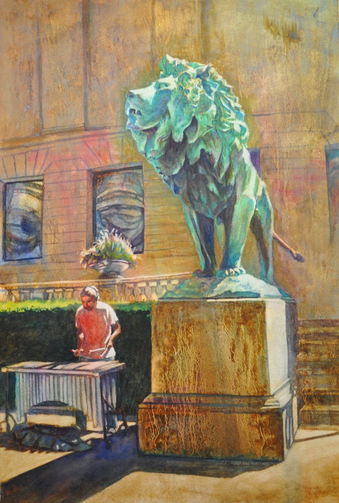 |
| Art Institute, Chicago watercolor by Cathy Walls |
As you can see, the members of the Delaware Watercolor Society who took this workshop did some fabulous work! People seemed to enjoy the process of using stencil brushes to lift out their shapes and give form to their statues. I feel it is very liberating because it is so easy to achieve those elusive soft edges just the way you want! I don't always paint this way, but even with my other painting I often use stencil brushes to soften edges and get exactly the look I want. After all, they say "it all happens at the edges", and I think this is really true with watercolor. So, the take home message of this article is: Consider using liftable paints and stencil brushes to create form in your paintings!
Thanks to the Delaware Watercolor Society for inviting me to teach this workshop-- it was a wonderful group and a lot of fun!
Susan Avis Murphy, ARThouse, 9/9/14


